This is my blog site for all my projects and work from my Media Production Course at Suffolk New College. I will be constantly updating this space with videos, music and photography for anyone to look at/ try to enjoy. Along with research and evaluations for tutors at my college. Please comment if you enjoy any particular piece.
After hearing about ideas from all our groups members we could see a pattern arising, where it is mainly aimed at a male audience and are exciting and full of action which would apply to the male crave for action and competition. Or they were humorous and memorable with a desirable out come as a direct result of buying the product. Men tend to want to be better and be part of the 'greed' technique. So if we say that you will get this product plus a benefit which we outline they are far more likely to want the product.
Our target audience of 14-18 year old males is outlined on one of my other posts. They like to be with friends, they are competitive and like to be part of the crowd. So we decided to use all three of these elements in our piece. It will show a number of men comparing the last time they 'got some'. This shows a large number of men getting the product, promoting the bandwagon technique and comparing their last time makes it competitive, also using sexual innuendo and enigma, not revealing it isn't sex until the end will be humorous too.
Synopsis:
Our idea was to use the phrase ‘get some’ which can used in reference to sex and right at the end show that the actors were talking about the drink.,‘Gren-ade’. We decided to simply make it a very male dominated advert too, showing obviously who the drink is aimed at and inspire a ‘bandwagon’ that they may wish to be a part of.
There will be a number of fast flowing vox-pops which we feel will make it seem realistic and make the actors seem like genuine people. This will hopefully make the product much more desirable as it may not be obvious that people are being told what to say. All of them will be saying the last time they ‘got some’ which will originally seem like they are discussing sex. The first vox-pop will repeat the end of the question to give the answers a subject. But by missing it out in the first place we save time and make it very quick to start and get the narrative started.
For example the first person ‘interviewed’ will say “The last time I got some was 3 weeks ago” and the the next will say “This morning” or “yesterday at dinner”. We are planning to moving onto funnier ones later on which when applied to sex are funny but when applied to drink seem quite normal. For example ‘I my mate let me finish his off once’.
Then it the near to the end we will see an actor standing alone with the shot on above his waist making ‘pleasured faces’ by smiling, eyes closed, biting his lips and moaning. Then he will look down and say ‘I’m getting some, right now’ then he will lift up the can and drink it. Also unexpectedly the it may produce an ESP that this drink is as important and good as sex. Which with guys I feel would be a large attraction.
After this shot a title will shoot up with the name and then a crowd of people screaming ‘GET SOME’ which would be very forceful and inviting, adding more to the bandwagon technique.
My CD Cover will be for band ANAXIS. They have not currently got album artwork so I will be creating an idea and developing it to be a complete album artwork.
The Album is called 'Away From The Crowd' and the band plays punk/heavy rock music and they are very energetic and passionate about issues and life. This is necessary to know as the artwork needs to reflect the band and album. As with most rock band covers there should be a high amount of contrast and dark colours however I would like to add a fun twist on the image.
My first ideas are as follows:
Two groups of people: Text in centre
A dark empty room/stage: Text at bottom/top.
A crowd with three people cut out and deleted.
Two fighters with smiley faces replacing theres: Text middle lower third.
An upside down image, seems warped but not obvious.
The letters will be in capitals to show the power, impact and style of music.
These images are the ones I feel can be used on the cover because it relates to the title or shows the passionate and energetic element.
A very interesting image, excting and warped. Could be used exactly how it is or edited.
Very fun and exciting with high contrast. Bright lights against background is quite eye-catching. Possibly the same colours could be used in the text.
Represent rock music and also being away from the crowd with the two. They seem surrounded which could represent independance instantly.
I started with the Ballet image to begin with, I had the idea of editing her to be onstage with a rockband or adding on headphones (like in the ipod adverts) which would be quite fun. However I decided it would be alot more effective to 'badly' put an smiley face to replace hers almost like a sticker or graffiti. I chose an angry face to change the mood even more.
This is the first cover I had completed.
This is the complete package/cd case. I like how the two images on the front and back completely contrast each other, however I don't feel they both possess the same message. The ballet image on the right is an obvious joke image however the back is more serious and artistic. I don't think the two match. Also in the bottom half (the inside) I have decided not to use text because I feel it would be more effective with a pattern/plain colour.
This is the second image I produced using another image but with the same concept.
The image itself and the situation is quite humourous and I think the text and desaturated colours blend very well and put across a dark/rocky impression of the band. It keeps with the high energy element of the bands music however I feel this image puts them across as more of a comedy band which is not a true presentation. I decided no to develop this further.
This next image was one I thought was edited very well to give the correct style for the album. The image itself was well suited, showing a crowd and two people seperate. I changed the shadow colour balance to green to give it a darker and more mature style and I also made the 'highlights' more red to give it a little bit of anger as an emotion. Quite a powerful image which would suit the music while still standing out which the dominant green.
This is the last experimant I tested and eventually became the final piece. The beginning image focused on this sad and alone girl, sererated from the rest of the people behind her. Firstly it relates to the title. Secondly it is a very powerful image which could represent the bands emotion.
I decided to make the contrast between the girl and the crowd even more obvious by editing her using a filter in photoshop. It almost makes her seem like a ghost, showing just how alone this girl is that she almost seems invisible. At first glance this may seem more of a pattern which could interest artistic audiences however they could be drawn in after they realise and digest the image.
Below, the mirrored image on the back, has a different edit. Shows her as in focus while the back is more distorted than before, using the threshold edit.
I used the cyan coloured text so it stands out against the black and white image. However I feel it doesn't stand out as well as I would like from the lighter areas of the image.
I chose to go with yellow for the final piece, using experience from the research that most rock bands have high contrasting images and text and from the falling image I created.
This is the album layout I decided to use as the final piece. I feel it shows the passion of the band while being eye catching and interesting.
This type of photography basically is using the camera to ‘illustrate’ something.1
This means within the image you produce it will portray a meaning, emotion or in some cases tell a story. A well created a placed photograph will instantly tell the audience about the product or brand, using different techniques to portray specific messages.
There are different styles within illustrative photography. For example CD covers, book covers, product images for example those seen on online shopping websites and advertising a company. Wedding and event photography is included too as they are telling the story of the day. Some examples are below.
http://www.prohiphop.com/
http://sjaejones.com/wp-content/
http://i2.cdnds.net/
http://www.productphotographymanila.com/
The subject, lighting, spacing, location and colour use of the image can all change what the image represents and any messages it wants to relay.
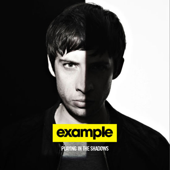
For instance, on an Example's Album 'Playing in the Shadows' the cover uses extremly heavy shadows and contrasting backgrounds on half of the image almost represent two sides to the artist and perhaps give the impression that the album has two styles of music or that it is a mix of music genres. Whereas LMFAO's 'Party Rock' album cover shows the two crowd surfing with a number of diverse colours, patterns, light streams and sparkles. This represents a club scene and high energy with their expressions and the attack of neon colours across the image. Some advertising uses illustrative photography to advertise their product. This following link gives a series of images with various chocolate animals, using cartoon style bulging eyes to represent the 'eye-popping' caffiene in their chocolate.
This image below is by Belgain Painter, Artist and Photographer Ben Haine. This image represents his diffrent forms of work, showing his diverse skill across many areas of illustration.
I have chosen to look more in-depth at CD Cover images and Location Photography.
LANDSCAPE PHOTOGRAPHY
Landscape photographs can be used across a range of media. Book Covers, CD covers, travel agencies website and brochures, documentaries, travel diaries all use landscape photography or specific locations. Photographers may aim to make it look as good as possible for holiday sales or represent the 'real' area (e.g favelas in Rio). They can be used to tell the story much easier and in more detail.
Landscape photography is seen as a popular style of the wide range possible. It basically means capturing any scale of land, mainly natural then and presenting it artistically and making it seem vast and amazing. Mainly the photography is of wide open spaces, using the light and natural landforms to create an interesting image. For example mountains, coastlines and waterfalls are regular stars in this form of photography. The equipment used is usually medium to large scale format with wide scale lenses. This ensures that the photography captures as much scenery as possible and captures the very fine detail in the entire shot. These photographs often feature in books by themselves, illustrating the areas or certain places in history but as I mentioned before they can be on novel covers such as the one below named 'In The Mountain' and are featured in a number of holiday website and brochures to make the location seem desirable and make you buy the holiday.
David Fleet is a 29 year old landscape photographer from the 'Isle of Harris' in Scotland his personal website (below) shows his work in and around the small island.
He only got started a few years ago but has recently turned professional selling his photographs.
He first decided to begin photography as a hobby after graduating from university appreciating using a compact camera for the first time. He knew he was very interesting instantly and began saving up to buy a Canon DSLR camera and researching and reading into different techniques of landscape photography. He says to this day that landscape photography is his favourite, due to the constant changing of weather and the changing light, which he says can cause some very beautiful pictures.
He currently runs his buisness from online sales and his newly set up gallery on the west of his island.
Lights – A variety of lights and set ups can give different effects the images you take, for example you can make someone look quite dark and mysterious by creating a lot of shadows on their face or you can light up there whole face for a friendly and happy picture.
Backdrop
Having a backdrop gives a neutral and constant background in the studio which makes it very easy to manipulate images afterwards (for example photo shopping them onto another photograph). Plus in addition with the lights you can create light spots on your photograph. Also the backdrop can give the image even more emotion or meaning. For example the red sheets can give an image of famous, rich and glamorous
Lenses
Different Lenses can create a number of effects on your images and can be used to create very unique images. For example a wide lense would capture more background than what normal human eye could see or a fish eye image could create an warped image.
Props
Having a range of props can impact of the photograph you take. Can create mood, add to the character you may be portraying or simply make it more interesting.
Enlargers
The enlarger helps you decide the size of the image and some have colour filters in the light which reaches the page, so you can create a wide variety of colours, depending on timings and any blockers you use. For example the image below if taken on a black and white film, using the colour filters you could make it a different shade or a completely contrast and warped colour such as red.
57.1 Research into photographers work
Cindy Sherman
Cindy, born in 1954, is an American who made her name know through self-portraiture.
When she works, she is alone in the studio when she is photographing, becoming everything from the make-up artist, director, wardrobe designer to the model herself. She usually serves as the model for all of her photos, using a variety of dresses and make-ups to give her a unique look for every photo.
The most famous series of images she produced were her ‘Untitled film stills’ which were released between 1977 and 1980. In this project she placed herself in a variety of film roles using characters from less popular films and film noir.
With all of her projects and all the series she has produced she is always the model dressed as a variety of characters. This allows her to have full control and creativity.
Her other projects include ‘Fairy Tales and Disasters’ and ‘History Portraits’ plus many other projects. She now currently lives in New York city still doing photography.
Larry Clark
Born 1943 Larry Clark originally started out photographing in his family business but later moved on to photograph his friends and later after study and his role in the Vietnam war, he released his book ‘Tulsa’ which portrayed his yound friends drug usage. After he followed up with ‘Teenage Lust’.
These completely uncovered another hidden side of teenage culture and gave America a huge “slap in the face’ ‘http://hardlywiser.blogspot.com/2009/03/china-girl.html’. Larry Clark wanted to show naïve parents how the kids are not ‘alright’ and he said that he wanted to show it in real life, which by his graphical images seems very well done. His main subject have always been, sex, drugs and violence.
He also is a film director and producer, however one of his films was banned for it’s sexual content.
My Self Portrait
My Finished Piece
Above is my completed two page spread for this project.
This was shot on the large camera we had use of which used 5x4 inch negatives because it gives an amazing quality shots which plenty of detail. This means that the image then produced would pick up everything I wanted,for example single eyelashes and eyebrows which just gave the image a more crisp finish and for my idea with the 'status' would have been vital. This is because the word 'intelligence' seems to represent high quality ideals and so I think a good quality photograph is needed to reinforce the status.
I chose the pose I am in in the photograph purely because it looks like I am in distant thought, looking off into the distance for inspiration. I also liked the idea of having shadows on my face except around the eyes which was achieved well. It almost seems as though there is a light source I am focused on which could represent to a viewer that I am looking off to a brighter place. I simply chose to look right to left on the final image because that is how a large portion of the world reads.
After shooting the image I had a negative I needed to develop. Since these negatives are so big we did not have any enlargers that they could fit into. Therefore we had to do contact prints where you lay the negative on the photo paper. It is a shame we couldn't enlarge because we could have produced very large images with very crisp detail.
First of all before wasting whole sheets of paper getting the correct exposure time I did a test strip where you expose different areas of the image for different amounts of time, signalling the correct amount of time you should be doing for when you move on to the full image.
A Test strip I did for another image. The darker strips were exposed for the longest. Each strip is a 5 second interval.
After exposing the full image (mine came to 12.5 seconds) you then carefully place the photo paper into the developer fluid for 1-2 minutes, then the wash for 30 seconds and into a fix for 5 minutes which stops the image fading in light.
After the photograph was rinsed and dried I it onto the scanner and had it scanned and after it was sent to my computer I opened it on photoshop.
This is the image I started with and I had to crop down and edit ready for the final A4 size picture.
After cropping and straightening my image I decided I wanted it a darker and to increase the contrast and bring in more shadows. I did this through the sliders in the menu bars at the top called 'brightness and contrast'. This gave a better and clearly difference from the incoming light and the rest of my face.
After this was finished I opened up another image at the size of an A3 spread and used rulers to mark out halfway. This is where I produced the final image above. To create the background for the typeface I took a chunk of the background from the photograph and 'transformed it' to cover the entire page. I tried it with a simple plain colour but this looked better because it had an almost bumpy texture which made it seem more 3D and special.
With the typeface I decided to use simply white because that in most terms usually means it is a 'fact'. I used the warp tool too, to create a fish eye effect on the writing. I did this to show it like it is 'expanding' and for example like a sort of 'ego' or a growing knowledge. Hopefully it was to represent the word intelligence. I was going to use a very stylistic font too, to make it seem very old style written but it was very hard to read when warped.
After this I added the small 'hmm.' which I think in a way gives the photograph the sound dimension, almost like a comic. I was hoping this would add more to the image in the viewers head while also making it seem more comical and lighthearted which, with the 'status' being quite funny should give it more emotion.
I feel the two sides compliment each other, keeping the grey shade all across the spread which is easy on the eye and quite relaxing plus the light on the picture and the white stands out extremely well against such a background giving key points of focus in the image.
If I were to do this spread again I would definitely experiment with another idea I had. This was to have two of my image mirrored against each other with the text in the centre. So the image would be myself practicing the look in the mirror. This would also give an interesting shape in the centre. I would also consider if I were to take the photograph again to hold hold a small piece of paper which says 'hmm.' which would make it seem more comical and less serious.
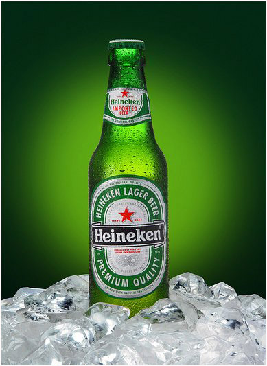
For experience and research into creating Tv Advert I need to analyse two that already exist and see what conventions and techniques they use to be successful. Using this I can tailor my own design to create a better and more gripping advert for my final product.
The two I have decided to analyse I feel apply to areas of my target group, one for the drink Lucozade and the other for an alcoholic beverage 'Heineken'.
1- Imprint the image and name of my created drink into the minds of the viewers.
2- Make it appeal to my target audience of 14-18 year old boys, pulling ideas from my prior research.
3- Create a fun and original advert which emphasises my drinks design and gives it an emotional and memorable link which if it was really being released would cause people to buy it.
MY TARGET AUDIENCE
I hope you can read my writing in this poor photograph. It outlines an average 14-18 year old boy, from my own personal experiences and what I have learnt from my primary research. I need to try and create an advert which applys to all of these and will interest them the most.
THE BRAND
Sorry about the sharpness but I had to use a computer 'sketchbook program which I am not highly skilled in' (yet). But this is the basic idea of the logo, just imagine it more shiny.
I have chosen the name BEAT, because it a common word used in terms of music and also to 'BEAT' is to win and with my young target audience music is a big part of there lives and dominates alot of social places, websites and activities they do and beat is constantly related to songs and energy. Plus on the male side there is alot of competition for everything so to win is to be the 'Alpha'.
'Let's Hit the Beat' is the slogan I've decided on for a number of reasons. There's wordplay in that 'hitting' and 'beating' can be the same thing and 'hitting the beat' is a phrase which means 'let's dance' or 'let's play' which are both energetic and fun activitys which the target audience want to be involved in. Then theres the word 'Let's' which signifies that this is a group thing and can apply to the 'BandWagon' technique of making people think they can join a group of people doing it and they can join with their friends.
I've chosen the three colours, blue, silver and red for the logo. Firstly because these colours go well together and don't clash and secondly because they are all very strong bright colours appealing to the male stereotype of strong and powerful. Thirdly they are all colours mainly associated to guys aswell. I was going to use gold instead of silver but I thought that they didn't suit aswell with the colours and I also think gold that could be associated to 'jewellery' which is more of a female aspiration.
These images were drawn and taken photos of and that is why they are not fantastic quality.
This is the design on the can, with similiar colours to the logo, (though there will be black writing on silver for smaller text so it is clearer). I think this will work well, being bright and eye grabbing, plus giving more room for the slogans and interesting images than boring text that my audience are less interested in.
THE ADVERT
The advert condensed into a sentence would be
A group of Teenagers are bored and unhappy, they find a new drink called 'BEAT' and suddenly they're all together dancing and head out for the night together.
How I see the advert is some extremely still shots of the teenagers, mostly males, in the middle of the day, alone in their houses. Their is no music except the wildtrack of thier homes. The first is banging his head against the wall, the second is falling asleep at his computer, the third is filing her nails and the fourth is rotating his feet. I feel this opening will firstly make it relatable as everyone has been in this state of boredom before and also should make it quite humourous with how sad and pathetic they look in the situation.
Next there is a drum kick, which causes a sort of shock to each of them and we see person four jolt his view offscreen. Here we see a shot of the fridge, seeming quite small and insignificant. Person 4 returns to his feet when the same noise kicks in. This time it cuts to person 1, who begins to walk over to is fridge, cautiously and all of the others in various shots do the same jolting upright whenever they hear the sound which keeps becoming more and more frequent. Until it is a steady 60 bpm. This part is to build up a tension while continuing the fun and humourous mood as they are scared of something, which seems to be the fridge. The shots will cut between each of them with each beat.
As they reach there fridge, number 2 grabs the door and pulls it open a crack. The sound stops and the camera peeks in from his first person view to see a can of beat sitting alone inside. Number three looks confused and reaches in to grab the can. This causes a sort of anti-climax and builds more confusion and tension.
Then we cut to 4 drinking the beverage and as soon he swallows an upbeat electronic song starts and he looks confused as his body starts dancing. The screen cuts into 4 sections where each of them are dancing in there kitchen. Then it cuts back to just 4 staring at the can completely still he then drinks more, spins around to see the other 3 standing in the same room. Then they all start dancing again and leave through the front door. I think this ending will, with the dancing continue the humour but also with regards to the target audience will show friends dancing together and use an 'emotional selling point' of fun and energy which will imprint into the viewer.
Overall it shows 4 teens alone and ends with them dancing together and heading out which is what teenagers desire, to be with their friends having fun.
The characters I would use would be very trendy and attractive with alot of new gadgets in their homes, which would make use of the 'snob appeal' technique mentioned in another post where viewers believe if they drink this drink they could be like them.
The camera shots and editing will start of as quite slow to begin with (not for too long as people may get bored) and slowly get faster as the music and advert progress. With the dancing the editing will be much quicker and the camera will move with there grooves.
This project which will span a number of posts. Overall we will be planning and producing a TV Advert for a new fizzy drink we create targeted at 14-18 year olds and the first part of the process is researching existing campaigns, their images, photographs, adverts, logos and places they appear.
I will start with the highest valued company in the world, coca-cola who produce drinks such as Coke, Dr Pepper and 3,500 other brands.
As with all of them I will select a few different styles of advertising and analyse them.
This is the logo from Coca-Cola's drink FANTA.
Judging by the logo and other adverts this drink is aimed at a younger audience, maybe 12-24 year olds. Just from this logo, it seems to be aimed at the younger generation because of it's extremly bright colour, simplistic shape and clear writing. Also it's shape, colour and small leaf like shape above the name makes it similar to an orange, which may appeal to a more health concious part of the population and offer a more healthy alternative to other fizzy drinks. Plus with other drinks on the market for sports based energy this may make people form a link between the two. So they may seem that by drinking this they can enjoy it without feeling guilty even though that may not be the truth. The typeface is very modern and have a similarity to graffiti which is seen as very trendy with alot of young people.
This advert is for the drink Diet Coke, coke without sugar, very popular with women and people watching their weight or sugar intake. Therefore alot of the adverts involve women looking their best, always having fun and empowering to women. For example you can see in this advert a group of attractive women in a very empowering pose. Then them being together in a fighting formation all together in one colour makes them seem like a force to be reckoned with. This is very female empowering image, and then women viewing the piece will make the connection between diet coke and power hopefully making them want to be part of this powerful crowd.
The perception and domination of the photograph in the advert gives attention straight to the women so to grab their audience straight away. On top of that the text is in relation to fashion using the phrases 'good taste' and 'statement' which is a big sway and interest of many women. This poster applies to many of the advertising techniques, the main two are Snob Appeal because all of these women are very attractive and seem very upper class and as many people desire to be the same they feel buying Diet Coke may include them. The other is the 'glittering generalities' which is where the text comes from, using words and names which appeal to the audience and make it seem glamourous and life changing.
This coca-cola advert is defiently aimed at the younger generation, perhaps 14-25, and judging by the layout and colours this is more aimed at females with the pink artwork, the heart shape and the background which suggest the sky, grass and the beach. Other groups this appeals to is people interested in live music because of all the instruments, the headphones and the dancing figures. In the image all of this is spilling out of the bottle of coke, therefore a quick declaration is that drinking coke can bring you the fun activites it represents,
The text imprints that idea that the coke 'life' is full of fun and love, which is something lots of people desire. The techniques this one uses are many again but the two most effective, will be the emotional selling points with the use of the happiness and love emotions and the 'glittering generalities' I described earlier.
Other than Coca-Cola there are other smaller companies who have there own successful programs.
Pepsi Max Advert
This Pepsi Max advert, shows a group of friends getting another out of a boring situation into one he wants to be in which is out with mates. This causes this drink to mainly be directed towards males, perhaps young adults to 16-30 who have been in these situations and enjoy having a laugh with their friends. Women do to, however I feel the humourous situation they are in more applys to men, and pranking which is definetly more popular with the male sex. I think bandwagon is a big technique used here, as alot men are mischeavious and enjoy the idea of jokes and trickery, almost like their inner child wants to be set free, just like the advert and the 'emotional selling point' of this advert is fun.
Relentless
This the logo for Relentless, the energy drink quite recently released in the UK. My first impressions from this logo are that it's aimed at a teenage to young adult group of people. Other groups I think that may be targeted are people into sport and energetic experience. Thats what I would gather from the word 'Relentless' itself, plus the graffiti like artwork around the text and the font itself, seems very modern and exciting which may appeal even more to a younger energetic audience. The colour varies between each flavour of relentless there is but they are all very strong and deep colours which suggests power and would again appeal to this audiences.
This website is the 'Red Bull' Official Uk website, filled with content, news and videos from all of their endorsed and sponsorships. For example their name appears across many different Extreme and high octane Sports such as 'Superbikes', Parkour, Cliff Diving and many others.
This is a clever way on promoting their drink because this is a website that would appeal very well to their young and sporty target audience (not that this is their only target audience) as this website features some breathtaking images, news reports, music and links to upcoming events they are hosting. So this will keep bringing people back and create may create an emotional link (selling point) between extreme sports, music and the drink red bull which is a very effective link. Plus using as the famous faces they sponsor may cause viewers to jump on the 'bandwagon' and drink red bull in an attempt to be like them.
In the 'products' section they use the 'card stacking' technique as Red Bull is loaded with some ingredients not very beneficial to health however they focus on the good 'short term' effects of the drink, especially effective when they use scientific papers as sources for evidence. Constantly throughout this website you are being reminded that 'Red Bull' endorses this and so causes a link between success and the fizzy drink, which is a clever technique this website uses.
This is a banner produced to advertise the drink Tango. I also think this is aimed at the younger generation for a variety of reasons. Firstly is the element of danger put across by the orange and black, a usual association with hazards. A sweeping generalisation is that younger people crave danger and excitement, usually males, so this would be a first 'emotional link' made between the drink and fun. Secondly is the text in the banners saying 'caution' which backs up the first point, that this is an dangerous drink which younger people would think is rebellious, maybe because parents and teachers would stop them doing anything like that.
The phrase 'will the extra get ya?' suggests two things, that perhaps this is better value because of the word 'extra' tricking people into thinking it's worth more than normal drinks which is using the 'bribery technique' and also it sounds like a challenge. People may see this and feel like they need to try the drink to prove they can overcome the 'extra'. Plus this rhyme of 'extra and get ya' is easy to remember and may stick with them after they have seen it.
Lastly in the younger generations, perhaps between 16 and 24, taking drugs and experimenting with them is in large circulation in their peers. Plus a lot of the 'cool' famous people who they look up to take them or sing about them in a positive way and the word 'side effects' suggests the use of medication or drugs. This may appeal to them as a alternative, seeming to come across as a drug, with that phrase and all the of the 'danger' colours and writing, but which also being legal, cheaper and less dangerous than the ones they have heard about or seen. This is almost using the 'magic ingredients' technique offering something other drinks don't have. Very well suited to a young audience who long to look the coolest and stand out from their peers.
In conclusion, you can see that most of these adverts I have chosen are mainly aimed at the younger generation, appealing to their interests and targeting them in the areas they visit and want to see most.


.jpg)


