The Album is called 'Away From The Crowd' and the band plays punk/heavy rock music and they are very energetic and passionate about issues and life. This is necessary to know as the artwork needs to reflect the band and album. As with most rock band covers there should be a high amount of contrast and dark colours however I would like to add a fun twist on the image.
My first ideas are as follows:
Two groups of people: Text in centre
A dark empty room/stage: Text at bottom/top.
A crowd with three people cut out and deleted.
Two fighters with smiley faces replacing theres: Text middle lower third.
An upside down image, seems warped but not obvious.
The letters will be in capitals to show the power, impact and style of music.
These images are the ones I feel can be used on the cover because it relates to the title or shows the passionate and energetic element.
A very interesting image, excting and warped. Could be used exactly how it is or edited.
Very fun and exciting with high contrast. Bright lights against background is quite eye-catching. Possibly the same colours could be used in the text.

Represent rock music and also being away from the crowd with the two. They seem surrounded which could represent independance instantly.
I started with the Ballet image to begin with, I had the idea of editing her to be onstage with a rockband or adding on headphones (like in the ipod adverts) which would be quite fun. However I decided it would be alot more effective to 'badly' put an smiley face to replace hers almost like a sticker or graffiti. I chose an angry face to change the mood even more.
This is the first cover I had completed.
This is the complete package/cd case. I like how the two images on the front and back completely contrast each other, however I don't feel they both possess the same message. The ballet image on the right is an obvious joke image however the back is more serious and artistic. I don't think the two match. Also in the bottom half (the inside) I have decided not to use text because I feel it would be more effective with a pattern/plain colour.
This is the second image I produced using another image but with the same concept.
The image itself and the situation is quite humourous and I think the text and desaturated colours blend very well and put across a dark/rocky impression of the band. It keeps with the high energy element of the bands music however I feel this image puts them across as more of a comedy band which is not a true presentation. I decided no to develop this further.
This next image was one I thought was edited very well to give the correct style for the album. The image itself was well suited, showing a crowd and two people seperate. I changed the shadow colour balance to green to give it a darker and more mature style and I also made the 'highlights' more red to give it a little bit of anger as an emotion. Quite a powerful image which would suit the music while still standing out which the dominant green.
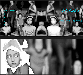
This is the last experimant I tested and eventually became the final piece. The beginning image focused on this sad and alone girl, sererated from the rest of the people behind her. Firstly it relates to the title. Secondly it is a very powerful image which could represent the bands emotion.
I decided to make the contrast between the girl and the crowd even more obvious by editing her using a filter in photoshop. It almost makes her seem like a ghost, showing just how alone this girl is that she almost seems invisible. At first glance this may seem more of a pattern which could interest artistic audiences however they could be drawn in after they realise and digest the image.
Below, the mirrored image on the back, has a different edit. Shows her as in focus while the back is more distorted than before, using the threshold edit.
I used the cyan coloured text so it stands out against the black and white image. However I feel it doesn't stand out as well as I would like from the lighter areas of the image.
I chose to go with yellow for the final piece, using experience from the research that most rock bands have high contrasting images and text and from the falling image I created.
This is the album layout I decided to use as the final piece. I feel it shows the passion of the band while being eye catching and interesting.
Photo Credits
Lobster Fight : funtarded.com/
Two Men Alone in Crowd: Reiner Asscheman
Alone Girl : yasir82.deviantart.com/
Cayusa : Man in lightsIan Lott: Falling off the face off the earth.


No comments:
Post a Comment