About Me

Felixstowe, Suffolk, United Kingdom
This is my blog site for all my projects and work from my Media Production Course at Suffolk New College. I will be constantly updating this space with videos, music and photography for anyone to look at/ try to enjoy. Along with research and evaluations for tutors at my college. Please comment if you enjoy any particular piece.

Thursday 20 October 2011

Developing The Advert - Group Idea


Developing the Group Idea:

After hearing about ideas from all our groups members we could see a pattern arising, where it is mainly aimed at a male audience and are exciting and full of action which would apply to the male crave for action and competition. Or they were humorous and memorable with a desirable out come as a direct result of buying the product. Men tend to want to be better and be part of the 'greed' technique. So if we say that you will get this product plus a benefit which we outline they are far more likely to want the product.

Our target audience of 14-18 year old males is outlined on one of my other posts. They like to be with friends, they are competitive and like to be part of the crowd. So we decided to use all three of these elements in our piece. It will show a number of men comparing the last time they 'got some'. This shows a large number of men getting the product, promoting the bandwagon technique and comparing their last time makes it competitive, also using sexual innuendo and enigma, not revealing it isn't sex until the end will be humorous too.

Synopsis:

Our idea was to use the phrase ‘get some’ which can used in reference to sex and right at the end show that the actors were talking about the drink.,‘Gren-ade’. We decided to simply make it a very male dominated advert too, showing obviously who the drink is aimed at and inspire a ‘bandwagon’ that they may wish to be a part of.

There will be a number of fast flowing vox-pops which we feel will make it seem realistic and make the actors seem like genuine people. This will hopefully make the product much more desirable as it may not be obvious that people are being told what to say. All of them will be saying the last time they ‘got some’ which will originally seem like they are discussing sex. The first vox-pop will repeat the end of the question to give the answers a subject. But by missing it out in the first place we save time and make it very quick to start and get the narrative started.

For example the first person ‘interviewed’ will say “The last time I got some was 3 weeks ago” and the the next will say “This morning” or “yesterday at dinner”. We are planning to moving onto funnier ones later on which when applied to sex are funny but when applied to drink seem quite normal. For example ‘I my mate let me finish his off once’.

Then it the near to the end we will see an actor standing alone with the shot on above his waist making ‘pleasured faces’ by smiling, eyes closed, biting his lips and moaning. Then he will look down and say ‘I’m getting some, right now’ then he will lift up the can and drink it. Also unexpectedly the it may produce an ESP that this drink is as important and good as sex. Which with guys I feel would be a large attraction.

After this shot a title will shoot up with the name and then a crowd of people screaming ‘GET SOME’ which would be very forceful and inviting, adding more to the bandwagon technique.

Wednesday 12 October 2011

Cover Illustration - Ideas and Development

My CD Cover will be for band ANAXIS. They have not currently got album artwork so I will be creating an idea and developing it to be a complete album artwork.

The Album is called 'Away From The Crowd' and the band plays punk/heavy rock music and they are very energetic and passionate about issues and life. This is necessary to know as the artwork needs to reflect the band and album. As with most rock band covers there should be a high amount of contrast and dark colours however I would like to add a fun twist on the image.

My first ideas are as follows:

Two groups of people: Text in centre
A dark empty room/stage: Text at bottom/top.
A crowd with three people cut out and deleted.
Two fighters with smiley faces replacing theres: Text middle lower third.
An upside down image, seems warped but not obvious.

The letters will be in capitals to show the power, impact and style of music.


These images are the ones I feel can be used on the cover because it relates to the title or  shows the passionate and energetic element.


A very interesting image, excting and warped. Could be used exactly how it is or edited.

Very fun and exciting with high contrast. Bright lights against background is quite eye-catching. Possibly the same colours could be used in the text.


Represent rock music and also being away from the crowd with the two. They seem surrounded which could represent independance instantly.

 
I started with the Ballet image to begin with, I had the idea of editing her to be onstage with a rockband or adding on headphones (like in the ipod adverts) which would be quite fun. However I decided it would be alot more effective to 'badly' put an smiley face to replace hers almost like a sticker or graffiti. I chose an angry face to change the mood even more.
This is the first cover I had completed.


This is the complete package/cd case. I like how the two images on the front and back completely contrast each other, however I don't feel they both possess the same message. The ballet image on the right is an obvious joke image however the back is more serious and artistic. I don't think the two match. Also in the bottom half (the inside) I have decided not to use text because I feel it would be more effective with a pattern/plain colour.
This is the second image I produced using another image but with the same concept.


The image itself and the situation is quite humourous and I think the text and desaturated colours blend very well and put across a dark/rocky impression of the band. It keeps with the high energy element of the bands music however I feel this image puts them across as more of a comedy band which is not a true presentation. I decided no to develop this further.
This next image was one I thought was edited very well to give the correct style for the album. The image itself was well suited, showing a crowd and two people seperate. I changed the shadow colour balance to  green to give it a darker and more mature style and I also made the 'highlights' more red to give it a little bit of anger as an emotion. Quite a powerful image which would suit the music while still standing out which the dominant green.

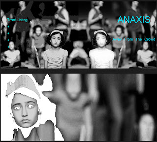
This is the last experimant I tested and eventually became the final piece. The beginning image focused on this sad and alone girl, sererated from the rest of the people behind her. Firstly it relates to the title. Secondly it is a very powerful image which could represent the bands emotion.
I decided to make the contrast between the girl and the crowd even more obvious by editing her using a filter in photoshop. It almost makes her seem like a ghost, showing just how alone this girl is that she almost seems invisible. At first glance this may seem more of a pattern which could interest artistic audiences however they could be drawn in after they realise and digest the image.


Below, the mirrored image on the back, has a different edit. Shows her as in focus while the back is more distorted than before, using the threshold edit. 

I used the cyan coloured text so it stands out against the black and white image. However I feel it doesn't stand out as well as I would like from the lighter areas of the image.

I chose to go with yellow for the final piece, using experience from the research that most rock bands have high contrasting images and text and from the falling image I created.


This is the album layout I decided to use as the final piece. I feel it shows the passion of the band while being eye catching and interesting.


Photo Credits
Two Men Alone in Crowd: Reiner Asscheman
Cayusa : Man in lights
Ian Lott: Falling off the face off the earth.


Cover Illustration

Illustrative Photography:

This type of photography basically is using the camera to ‘illustrate’ something.1
This means within the image you produce it will portray a meaning, emotion or in some cases tell a story. A well created a placed photograph will instantly tell the audience about the product or brand, using different techniques to portray specific messages.

There are different styles within illustrative photography. For example CD covers, book covers, product images for example those seen on online shopping websites and advertising a company. Wedding and event photography is included too as they are telling the story of the day. Some examples are below.

http://www.prohiphop.com/
http://sjaejones.com/wp-content/
http://i2.cdnds.net/
http://www.productphotographymanila.com/
The subject, lighting, spacing, location and colour use of the image can all change what the image represents and any messages it wants to relay.

For instance, on an Example's Album 'Playing in the Shadows' the cover uses extremly heavy shadows and contrasting backgrounds on half of the image almost represent two sides to the artist and perhaps give the impression that the album has two styles of music or that it is a mix of music genres. Whereas LMFAO's 'Party Rock' album cover shows the two crowd surfing with a number of diverse colours, patterns, light streams and sparkles. This represents a club scene and high energy with their expressions and the attack of neon colours across the image. Some advertising uses illustrative photography to advertise their product. This following link gives a series of images with various chocolate animals, using cartoon style bulging eyes to represent the 'eye-popping' caffiene in their chocolate.


This image below is by Belgain Painter, Artist and Photographer Ben Haine. This image represents his diffrent forms of work, showing his diverse skill across many areas of illustration.


I have chosen to look more in-depth at CD Cover images and Location Photography.

LANDSCAPE PHOTOGRAPHY


Landscape photographs can be used across a range of media. Book Covers, CD covers, travel agencies website and brochures, documentaries, travel diaries all use landscape photography or specific locations. Photographers may aim to make it look as good as possible for holiday sales or represent the 'real' area (e.g favelas in Rio). They can be used to tell the story much easier and in more detail.

Landscape photography is seen as a popular style of the wide range possible. It basically means capturing any scale of land, mainly natural then and presenting it artistically and making it seem vast and amazing. Mainly the photography is of wide open spaces, using the light and natural landforms to create an interesting image. For example mountains, coastlines and waterfalls are regular stars in this form of photography. The equipment used is usually medium to large scale format with wide scale lenses. This ensures that the photography captures as much scenery as possible and captures the very fine detail in the entire shot.  These photographs often feature in books by themselves, illustrating the areas or certain places in history but as I mentioned before they can be on novel covers such as the one below named 'In The Mountain' and are featured in a number of holiday website and brochures to make the location seem desirable and make you buy the holiday.


How to Create Expressive Landscape Photography
This link above shows a 12 page tutorial on the history and what methods photographers use to make the image successful.

DAVID FLEET

David Fleet is a 29 year old landscape photographer from the 'Isle of Harris' in Scotland his personal website (below) shows his work in and around the small island.

He only got started a few years ago but has recently turned professional selling his photographs.

He first decided to begin photography as a hobby after graduating from university appreciating using a compact camera for the first time. He knew he was very interesting instantly and began saving up to buy a Canon DSLR camera and researching and reading into different techniques of landscape photography. He says to this day that landscape photography is his favourite, due to the constant changing of weather and the changing light, which he says can cause some very beautiful pictures.

He currently runs his buisness from online sales and his newly set up gallery on the west of his island.
Here are some examples of his work:


http://www.davidfleetphotography.com/
http://www.benscamera.com/home/2011/04/29/photographer-profile-%E2%80%93-david-fleet/

ALBUM ARTWORK

The Aim of Album artwork or CD covers is to sell the album.


1http://www.acs.edu.au/info/photography/photo-technique/illustrative-photos.aspx